
How AI models show their reasoning process in real-time
A UX breakdown


AI’s reasoning, uncovered
Grok and Claude have unveiled their latest models, each enhancing transparency in their thought processes.
With this shift, major AI players are making real-time reasoning more visible and understandable, as transparency is crucial for building user trust.

Different AI models, different UX
Interestingly, every company has taken a different approach to making AI reasoning visible. Some prioritize simplicity, while others lean into depth.
Here’s key UX factors for real-time AI reasoning
When displaying AI reasoning, each model strives to balance several competing UX principles:
Transparency vs. Overload – How much reasoning is shown without overwhelming the user?
Feedback Mechanisms – What indicators signal that the AI is actively thinking?
Clarity of Presentation – How structured is the reasoning display?
Let’s look at how each AI model implements real-time AI reasoning.

1. ChatGPT o3-mini
ChatGPT concisely displays its reasoning and collapses when it's done. Users have to manually expand it for details.
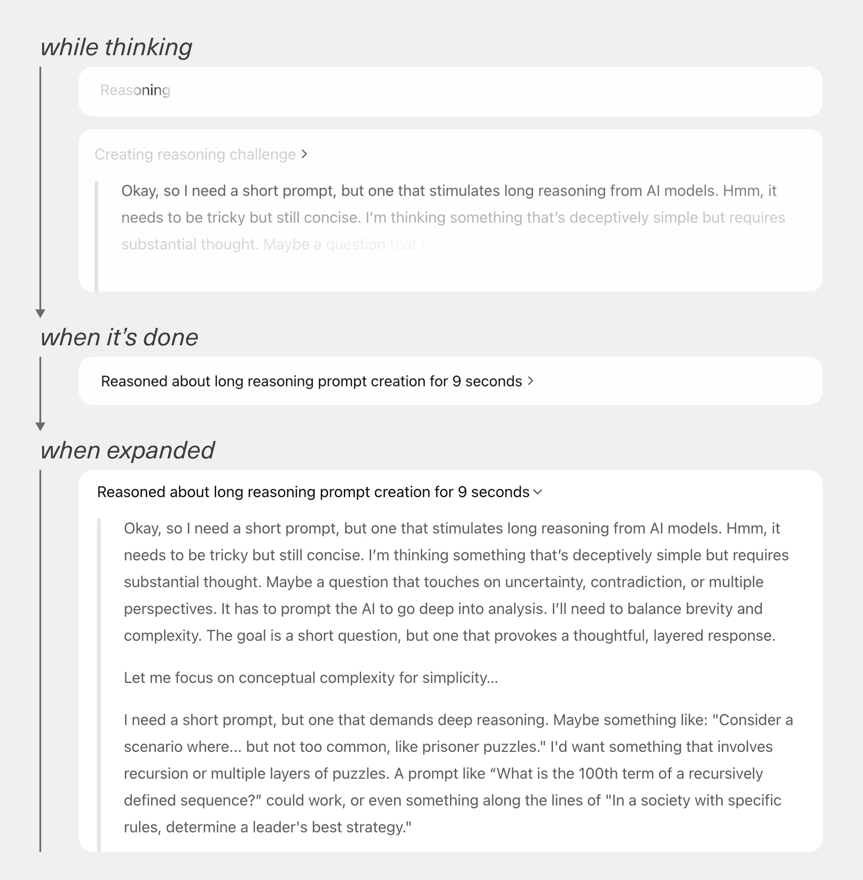
UX Approach
Flashing and changing text labels signal thinking progress.
Keep short reasoning visible, reducing cognitive load while providing something to read while the model is thinking.
Hide reasoning when done, allowing users to jump into answer
👉 Verdict
ChatGPT makes reasoning unobtrusive while providing some transparency—which may still feel opaque to users seeking deeper understanding.
2. Claude 3.7 Sonnet
Claude doesn't show its full reasoning process by default. Users can expand it anytime for details.

UX Approach
An animated icon, dynamic text label, and a time counter serve as progress indicators.
Reasoning is expandable, but it’s not immediately clear that users can expand it.
Reasoning section is separately scrollable and structured with bullets, giving clarity.
👉 Verdict
By default, Claude offers minimal transparency, letting users focus on the answers. When necessary, users can easily navigate the reasoning process.
3. Grok 3
Grok displays scrolling snippets of its reasoning process in a distinct section, though they aren’t fully readable as it’s fast.

UX Approach
A time counter, an animated icon, and scrolling snippets indicate active reasoning.
Reasoning section collapses once done, but clearly guides users to expand for details.
Reasoning is very detailed and long, but often repeats the final answer.
👉 Verdict
Grok manages user's perceived wait time with a scrolling UI. However, redundant and unstructured reasoning may overwhelm users.
4. DeepSeek R1
DeepSeek generates reasoning continuously, scrolling downward as its chain-of-thought expands.

UX Approach
The “Thinking...” label, continuously generated texts, and a throbber serves as indicators.
Reasoning is highly detailed but lacks a structured bullet format.
Keep users engaged with scrolling downward display.
👉 Verdict
DeepSeek emphasizes progressive reasoning, maximizing transparency. However, the lack of structure and too much detail may overwhelm users.
5. Gemini 2.0 Flash Thinking Experimental
Gemini represents its reasoning through continuously generated texts. But it’s not automatically scrolled.

UX Approach
A throbber and dynamic "Thinking..." label serve as indicators.
Users can scroll down at their own pace to read through during reasoning process.
Reasoning is structured with bullet points and numbers for clarity.
👉 Verdict
Gemini provides high transparency with detailed reasoning while giving users control over scrolling. However, it’s hard to recognize when the thought process is complete.
All AI models' reasoning at a glance
DeepSeek offers the most transparency, while Claude provides the most structured, low-overload reasoning experience.

Key UX Insights
✅ More transparency ≠ Better UX: AI should explain itself, but too much detail can be overwhelming. The right balance builds trust without adding cognitive load.
✅ The elevator mirror effect: Since AI takes time to generate responses, well-designed progress indicators can reduce perceived wait time and make interactions feel faster.
✅ Focus on user's goal: Users primarily seek answers, not reasoning. Overemphasizing transparency can inadvertently shift focus away from delivering answers.
AI transparency isn’t about revealing everything—it’s about showing the right reasoning at the right time to build trust without overwhelming users.
💡How can your product adjust transparency to build trust without overwhelming users?
Enjoyed this post?
Leave a comment below—I’d love to hear your thoughts. Or, forward this to a fellow product maker who might find it useful.
💡 Let’s make UX better together.
Such a good breakdown.
Insightful and well-articulated. I particularly agree with the importance of progressive disclosure to avoid cognitive overload. This approach not only enhances user experience but also ensures that AI interactions remain intuitive and manageable.
Given the importance of transparency in building trust with users, why do you think there isn't more advanced transparency about sourcing in AI reasoning systems?